Free tips and technique – flowers from life
Do you paint from photos or real life? I generally paint from photos on my laptop. The problem with using any photo to paint from (and particularly printed photos) is that the image is “flattened” and you lose much of the detail in light and shadow.
So flowers….. the gist of this tips and techniques tuition is to encourage you to place flowers directly on your paper and paint alongside them. This is a joyful painting experience and will help you to match colours and shapes, directly from the subject on the paper. I think that your levels of observation will improve – you can twist the flower and stem and really observe your subject from all angles.
Colour choices:
Hold the the tube or pan alongside the flower, see if it matches. If not, you can try to mix two colours on a scrap of paper. Hold the paper alongside the petals or stem and see whether you can recreate the colours in real life.
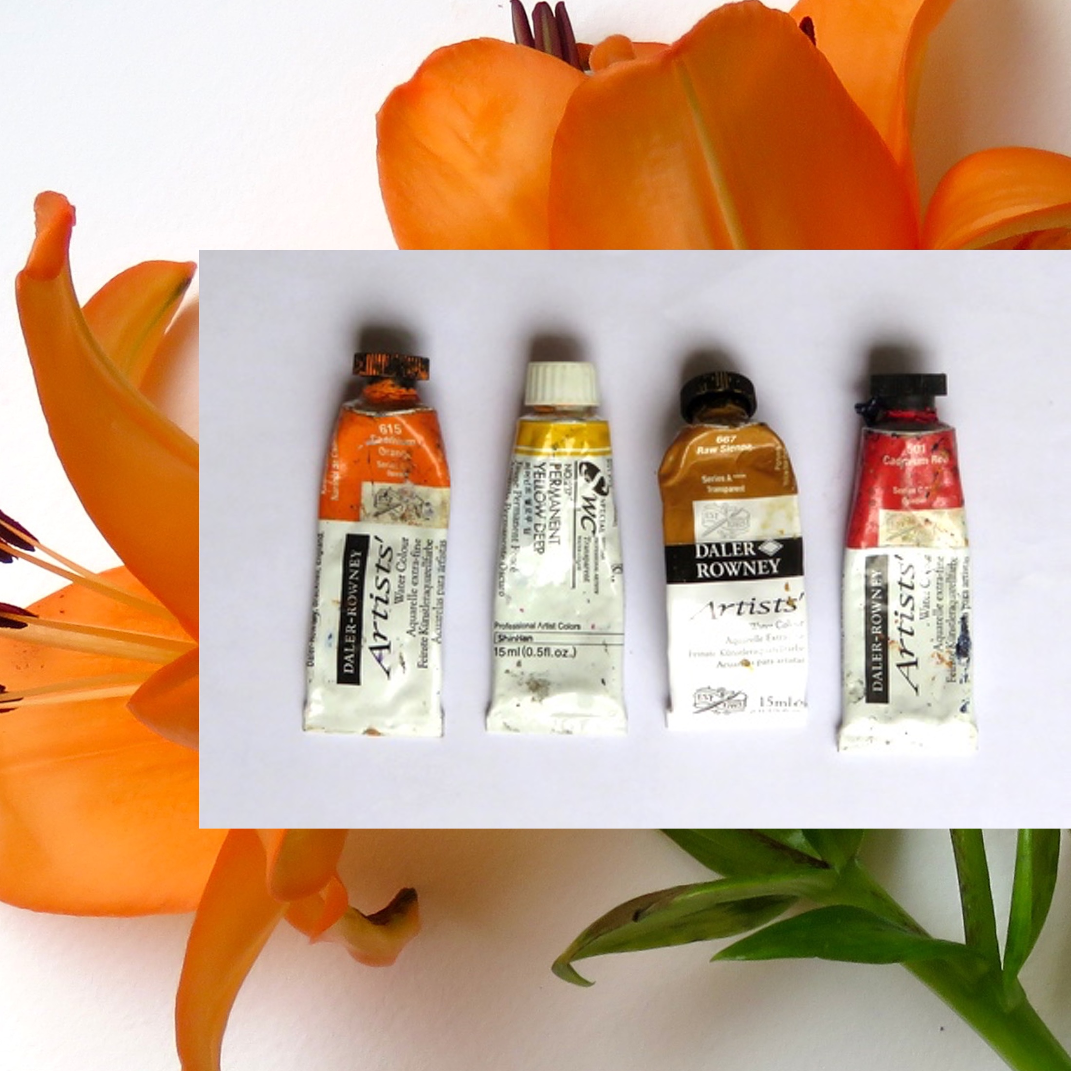
For the orange lily, Cadmium orange was an obvious colour to choose. A warm yellow is a nice addition. Cadmium red, used in moderation, can help in the shadow areas and tips to the petals. Green – I used ultramarine blue (adding yellow and Sienna to create the green)
Composition:
Here’s where the fun starts. Lay the flower across your paper and twist the flower around until you can see the flower at an angle that you like. The challenge is to try and make your painted flower on the paper as life-like as possible, as if it is part of the bunch. You can sketch the outline, or just “go for it”. I generally tend to wet the flower area in one block as I find the colours mix is a soft way. Then build up colours and sections to the petals using the colours you have chosen. The stamens poke out onto dry paper, so they have hard edges.
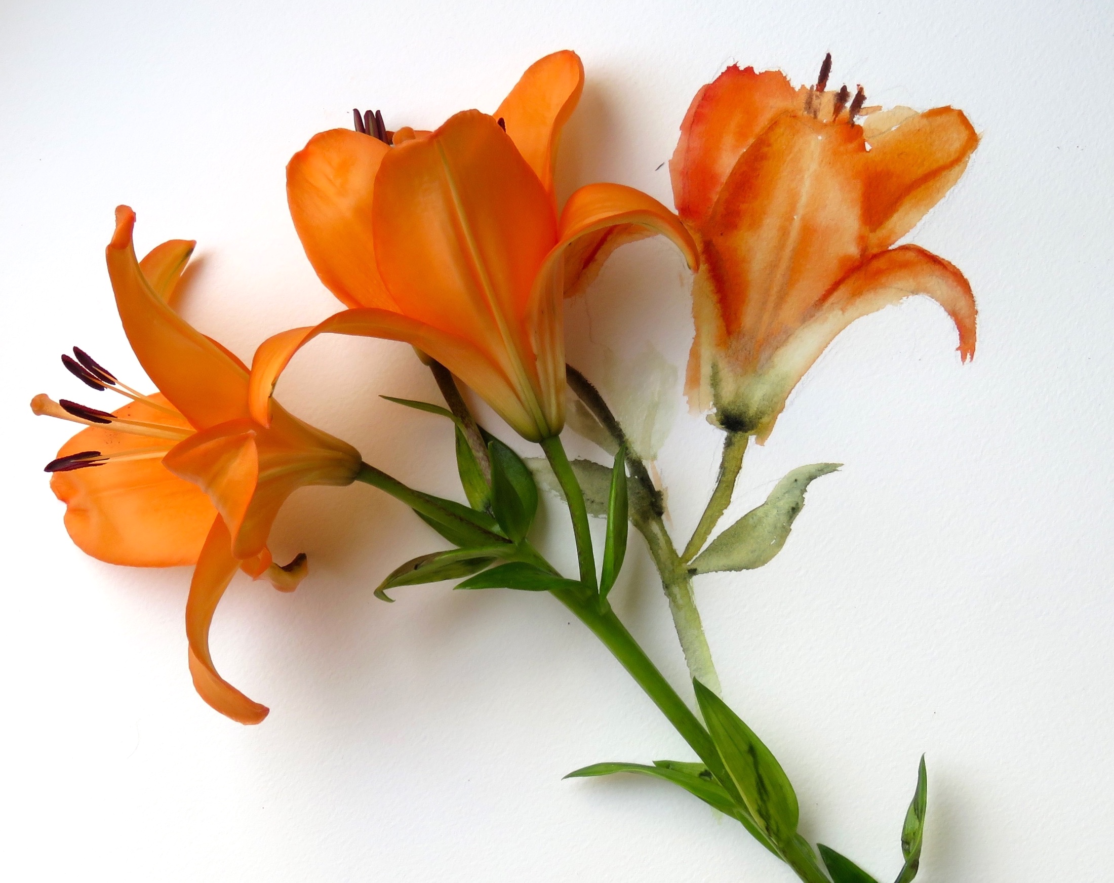
Study shapes carefully, and look for shadows and give good attention to the size and shapes of the petals.
If you want to carry on and expand on this little exercise, you could take the flower away from the painting and carry on painting the rest of the bunch.
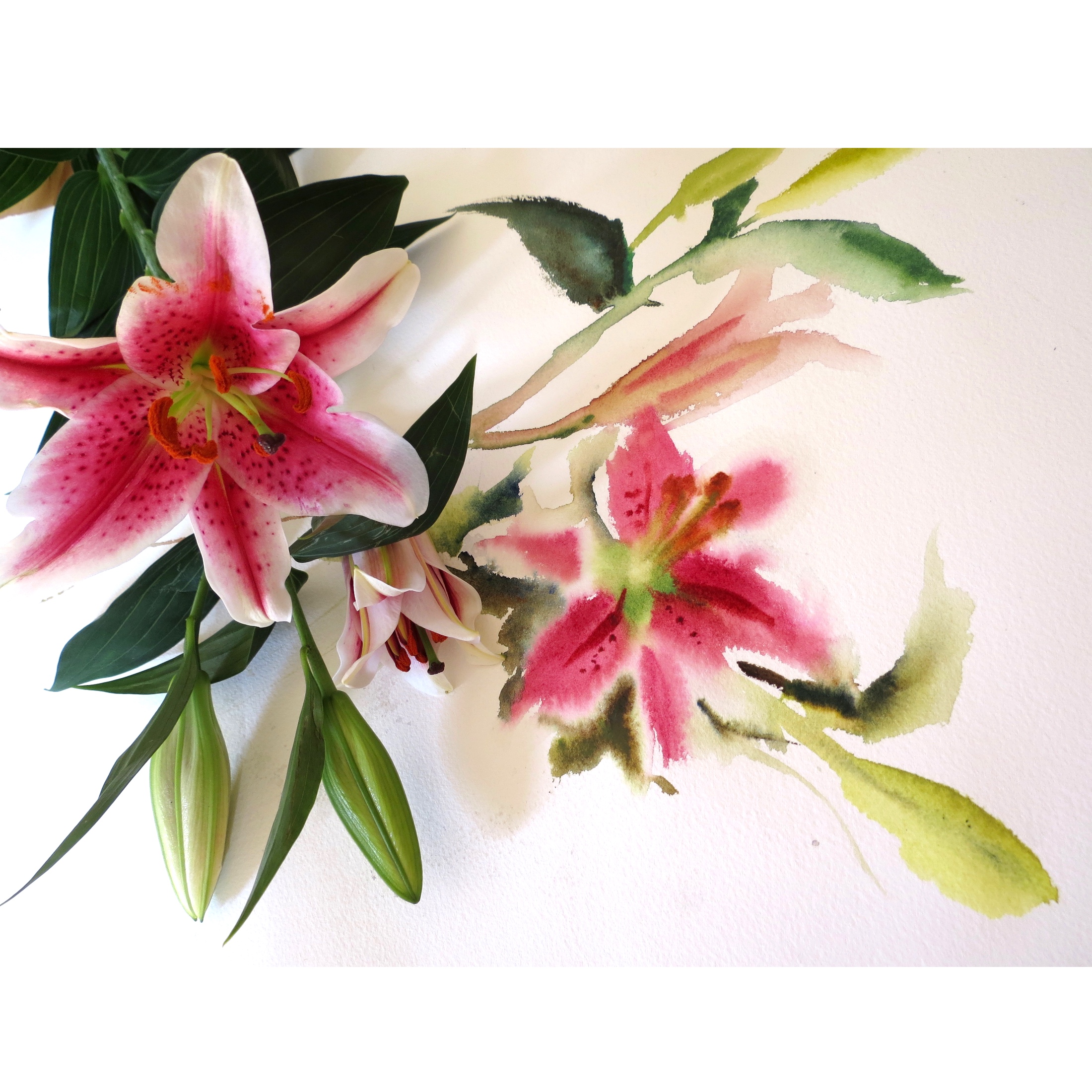
Stargazer Lilies:
The composition of this is a little more complex but follows the same principle.
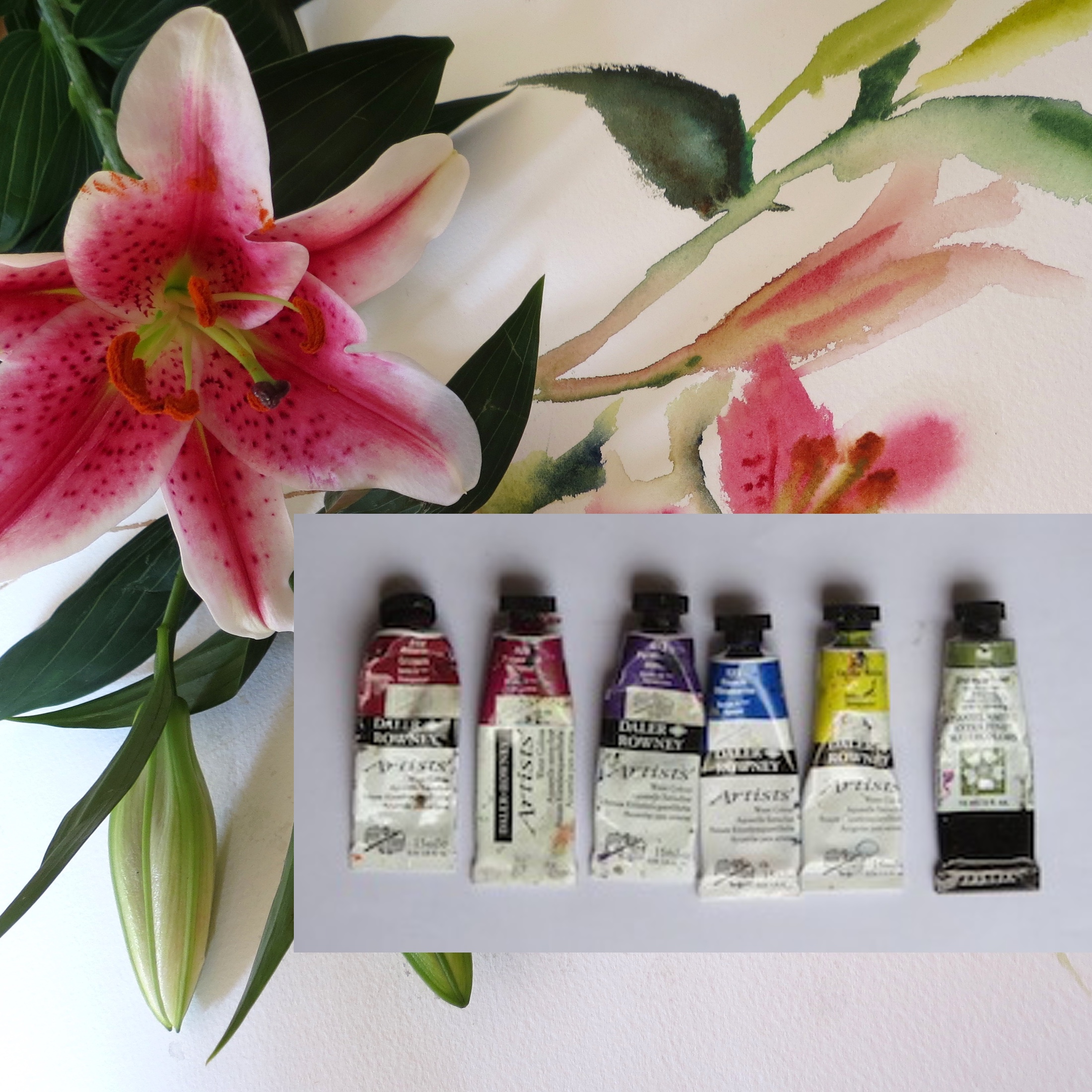
Colour choices.
Alizarin Crimson (cool red)
Permanent Magenta
Permanent Mauve
Ulramarine Blue
Lemon Yellow
Undersea Green
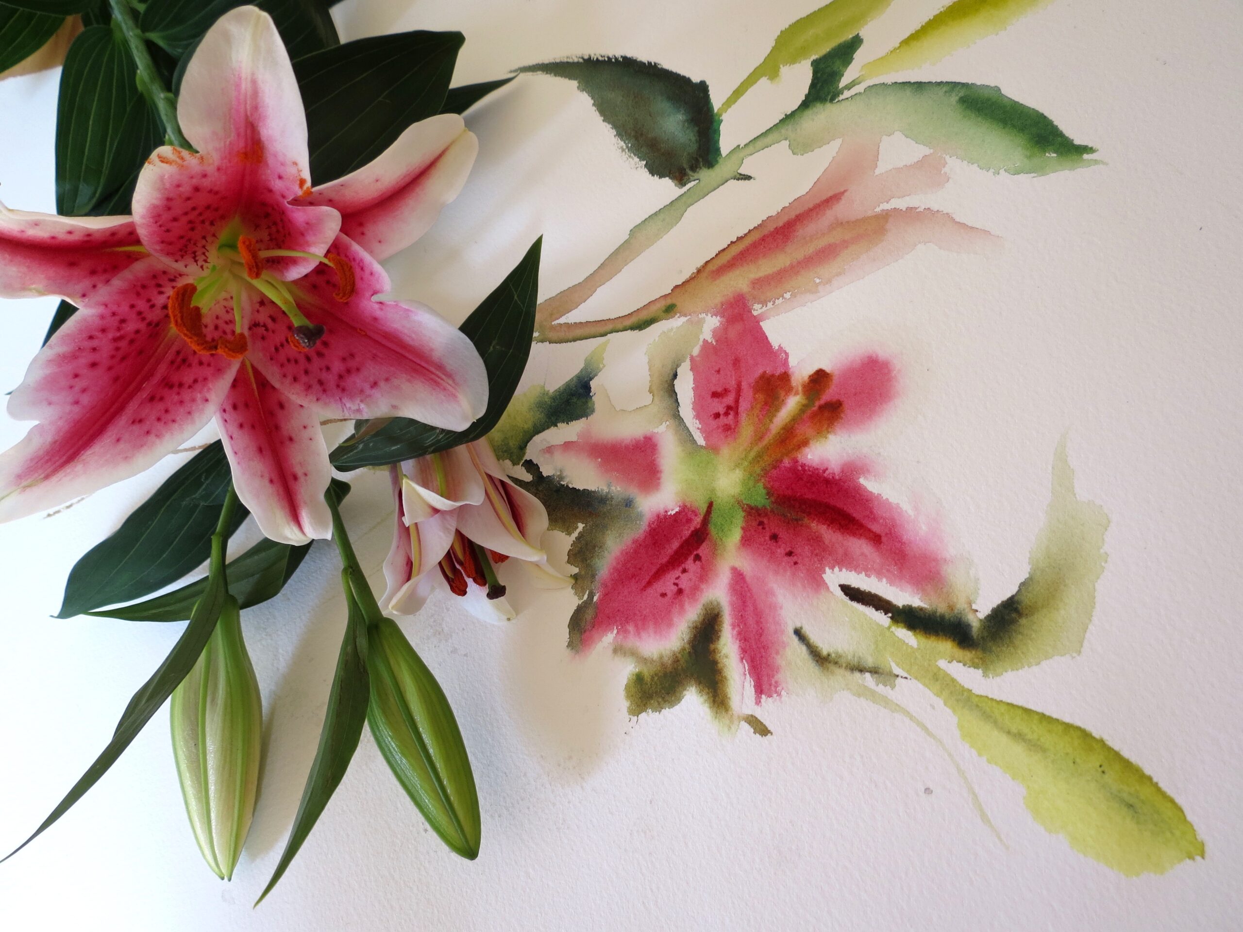
Composition
This time, you will see that the real flower is pointing downwards on the paper. I have allowed my painted stems to extend out of the edge of the painting at the top and towards the bottom edge. You can have fun and really experiment with composition. I have wet the flower area to achieve the soft wet in wet look – (some glimpses of dry paper have been left on the petal edges).
I hope you enjoy having a go with this exercise.
If you would like to paint alongside a video for another flower, apple blossom, here is a link to the tuition:
https://kayeparmenter.co.uk/product/apple-blossom/